


NALP
1025 Connecticut Avenue
Suite 1110
Washington, DC 20036-5413
Phone: (202) 835-1001
Fax: (202) 835-1112
E-mail: info@nalp.org
Another Picture Worth 1,000 Words
July 2008
Last year, NALP made headlines in the blogosphere with its now famous double bell curve graph showing the bimodal distribution of full-time salaries for the Class of 2006. Predictably enough, given the run-up of starting salaries at large law firms that happened during 2007, the graph depicting the distribution of salaries for the Class of 2007 still has two peaks but is even more dramatic. This graph (shown below) clearly shows the sharp peak at $160,000 where large firm starting salaries have settled for now, and contrasts with the relatively symmetric double peaks of last year’s curve.
What this image makes
visually manifest is the two very different legal employment markets
that law school graduates face. While 16% of starting salaries
were $160,000, far more, 38%, were $55,000 or less. The first
peak in the graph reflects salaries of $40,000 to $60,000, with
salaries of $40,000 and $50,000 each accounting for about 10% of
salaries. Collectively, salaries in the $40,000 - $60,000 range
(approximately the total area reflected under the left peak) accounted
for 42% of salaries. Salaries reflected under the right peak,
including the smaller bulge over $145,000, accounted for 22% of
salaries. This bimodal distribution of starting salaries for law
school graduates was not always the case however. As recently as
1999, starting salaries for law school graduates assumed a much more
normal bell shaped curve with a single peak. (See Salaries for New Lawyers: How Did We Get Here?, NALP Bulletin, January, 2008.) For more detailed information on the class of 2007, see the press release on the Jobs & JD's report for the Class of 2007 or order Jobs & JD's and Starting Salaries through the Bookstore.
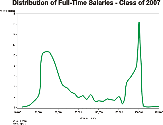
Source:Jobs & JD's, Class of 2007
Note: The graph is based on 23,337 salaries. A few salaries above $200,000 are excluded for clarity.
© 2008 NALP | 1025 Connecticut Avenue, Suite 1110, Washington, DC 20036-5413
Phone: (202) 835-1001 | Fax: (202) 835-1112 | info@nalp.org
© 2008 Antharia, LLC![]()
![[tell a friend]](2007Salaries_files/mail.gif "[tell a friend]") tell-a-friend
tell-a-friend
![[printer friendly]](2007Salaries_files/printer.jpg "[printer friendly]") printer friendly
printer friendly
------------------------------------------------------------------------------------------------------------------
Sitemap | Contact Us | Privacy Policy | Non-Discrimination Policy
© 2008 NALP | Design: Antharia